This is a structured exercise from the Harisenin UI/UX & PM bootcamp (Intermediate PM Mission 1) — the task is set by the program, not my own initiative. Shown here as evidence of method: competitive benchmarking from a business angle and a UX angle, then a product response.
01Context
The brief: benchmark two competing e-wallets — DANA and OVO — from a business perspective and a UX perspective, then use the gap between them to propose a new product concept. Analysis was done on an iPhone 13 (iOS 17).
02Business SWOT, condensed
| DANA | OVO |
|---|---|
| Strength: large user base, broad feature set (QRIS, Split Bill, DANA Goals, eMAS, DANA Bisnis), strong neutral backing (Emtek/Ant Group). | Strength: the strongest offline merchant network, a dominant market share, and OVO Points as an effective loyalty program. |
| Weakness: depends on a stable connection; merchant count can trail some competitors. | Weakness: a fee on bank transfers; a more complex interface for some users. |
| Opportunity: Indonesia's fast-growing digital economy; BI's open SNAP standard. | Opportunity: deeper financial literacy products; expansion beyond major cities. |
| Threat: intense competition and promo/cashback wars. | Threat: more minimalist competitors (DANA, ShopeePay) shifting user expectations. |
03UX SWOT, condensed
| DANA | OVO |
|---|---|
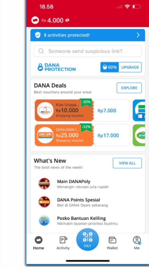
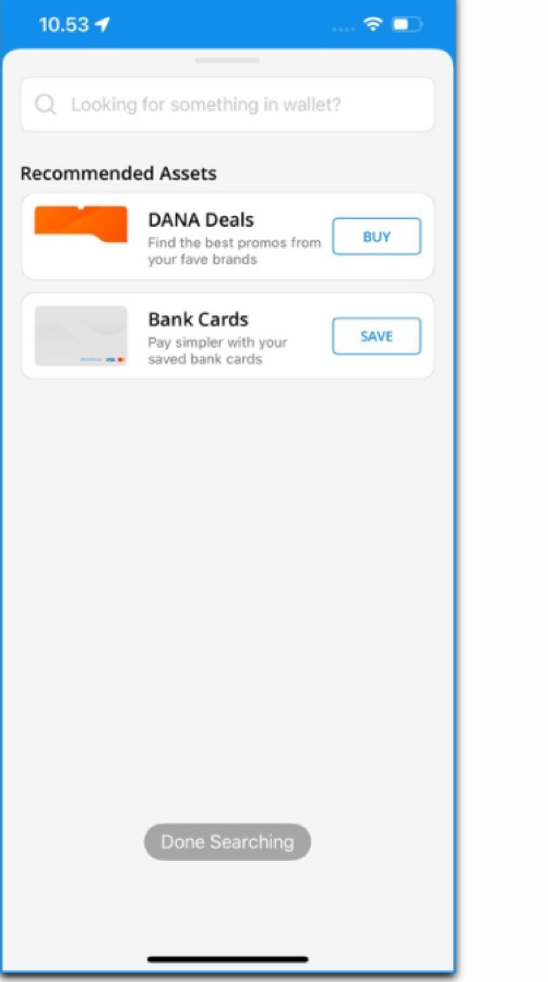
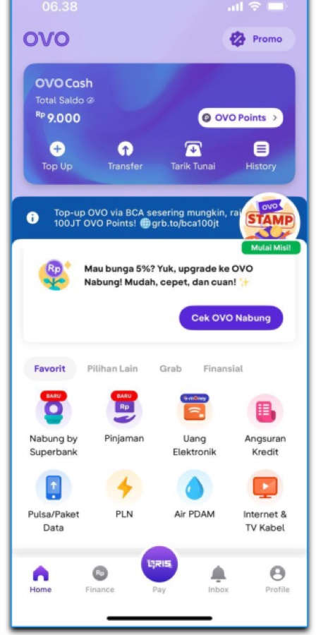
| Strength: simple, intuitive UI; fast transactions; a "PAY" button as the clear center of action; consistent DANA-blue branding. | Strength: primary actions close to the thumb (Top Up, Transfer, QRIS); deep Grab/Tokopedia integration extends use cases without leaving the app. |
| Weakness: inconsistent back-navigation on some screens; a long "All Services" list causes choice overload. | Weakness: a "cluttered" home screen from stacked promo banners; no in-app live chat to reach customer support. |
04Verdict
Business: OVO, slightly ahead — its captive ecosystem with Grab and Tokopedia funnels a steady stream of daily transactions that's hard for a standalone app to replicate, on top of an effective loyalty loop.
UX: DANA, ahead — a cleaner, lighter interface with fewer promo distractions makes the core task (pay, transfer) feel faster to complete.
05The gap → NADI
Neither app fully combines OVO's ecosystem reach with DANA's interface discipline. The proposed concept, NADI — Your Daily Finance Pulse, is a neutral, cross-ecosystem wallet built around transaction speed, a personalizable home screen, and direct user control (live CS and a Lite mode for weak connections or low-end devices).
Roadmap: Q1 — MVP release (QRIS, transfer, PFM Lite, live chat, Lite Mode) with KYC via a bank partner. Q2 — a smart payment router and a loyalty program, plus onboarding 50k QRIS merchants. Q3 — a business tier (checkout/settlement, invoicing) and an open API for partners. Q4 — an AI finance coach and, regulation permitting, cross-border QR.
06What this demonstrates
Reading a market from two angles at once — business model and user experience — then turning the gap between two incumbents into a concrete, phased product response rather than a vague "do both better."